
CONSIDERATIONS WHEN SUBMITTING A PRINT-READY FILE
Submitting a Print-Ready PDF
While we support the submission of artwork files from design programs such as Adobe InDesign, Adobe Photoshop, Adobe Illustrator or Microsoft Word and in some cases Microsoft Excel, it is, in most cases, necessary for us to convert files from these programs to PDF (Portable Document Format). While being the standard file format within the print industry, PDF is also the required file format needed in order to complete our digital workflow and ultimately process your print project toward completion.
The final step prior to print production is the imposition process, or setting up your job for output. For example, a simple business card may be placed multiple times on a large sheet of paper allowing for more economical output. A book or a brochure needs to be placed in such a manner to ensure that all pages back-up correctly when printed. Our impositioning software requires the PDF format in order to output the correct press layouts for printing. This being the case, a PDF that is print-ready is essential to a smooth workflow and successful print result.
The sections that follow explain elements to consider when successfully submitting a print-ready PDF.
Crop Marks & Bleeds
Crop marks give a visual indication where cutting is to occur in order to arrive at the proper finished size of a printed project. Bleeds allow for a slight margin of error during the cutting process should the paper shift slightly. If there is even a 1/64” shift to one side of the crop mark, without additional image outside the cutting area, the final resulting print image may show a white void. So, in order to avoid these blank white areas, we request additional image to extend beyond the finished cutting area. The sample images below illustrate this point. The typical amount of bleed (or, extended artwork) that is requested on all four sides of the image is .125”.
Most desktop publishing programs have presets allowing users to output PDF’s with crop marks and bleed areas. We’ve provided a separate resource section titled "Steps to Create a PDF with Crops & Bleeds" outlining the steps to create PDF’s with crop marks and bleeds. The workflow presented is fairly standard across various platforms.
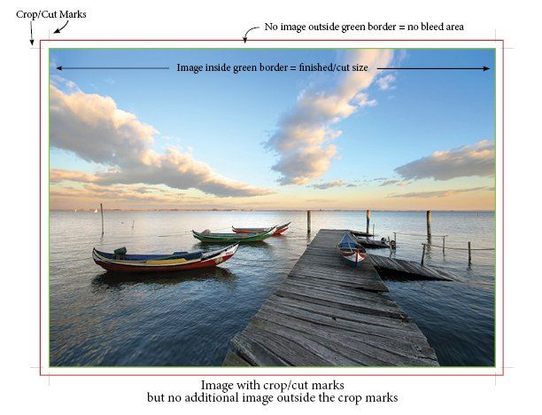
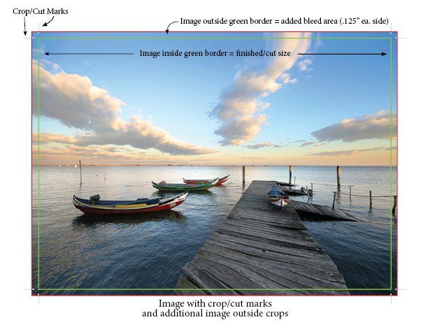
Image Resolution
In order for an image, particularly photos, to print in a crisp, focused manner, it is recommended that the image be high resolution. Most stock photography websites (i.e. Shutterstock.com, Thinkstock.com, etc.) provide images that are not only professionally created, but also high resolution. If images are provided from a digital camera, it is recommended to adjust to higher resolution settings to ensure that images will remain focused and clear when output for print.
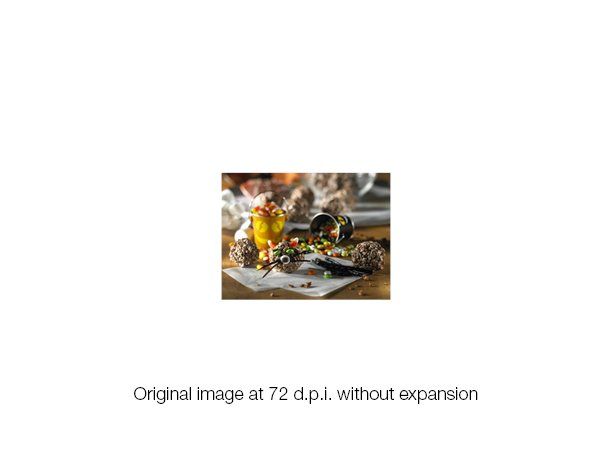
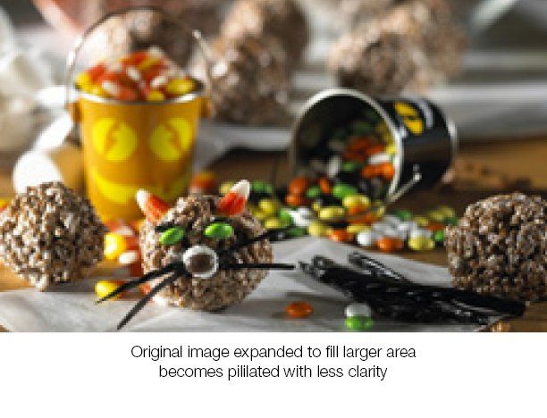
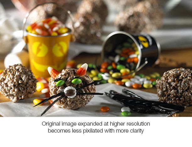
One consideration to keep in mind is the final size of the image. Generally, the larger the final size of the image, the higher the resolution of that image should be. For example, if an image is 72 d.p.i. (dots per inch), and the image is targeted to fill an entire 12 x 18 sized sheet, the image will need to be expanded to completely fill that area. In doing so, the image will lose clarity and focus and become “pixilated”. The graphics below illustrate this situation.
We recommend that images be 300 d.p.i. or higher to optimize clarity and ensure high resolution output.
Color Space
Most digital cameras produce images that are composed of a mix of three primary colors – Red, Green & Blue (RGB). This “color space” is ideal for previewing images on a computer monitor or other electronic device where print output is not a consideration. When images are destined for print media, these RGB images should be converted to a 4-color process. The four colors used in print media are a mix of Cyan, Magenta, Yellow & Black (CMYK). Although most images will be produced using the CMYK color space, predetermined “spot” or specific color requests are also available through the Pantone Matching System (PMS).
Color Considerations
It is said that a picture is worth a thousand words. In printing, a picture or a set of words is non-existent without color. In this section, we will briefly explore some color issues to keep in mind prior to outputting a print-ready PDF.
RGB vs. CMYK
In a previous discussion (see Image Resolution & Color Space) we explained the necessity to convert images that are RGB to CMYK. This is important for correct color printing.
Spot vs. Process (CMYK) Colors
When designing a printed project, you have the choice to select individual Pantone Matching System (PMS) spot colors or a combination of four Process (CMYK) colors. Prior to creating a final PDF for print output, it is important to ensure that your working file contains only the colors you are intending to print. In other words, if your job is to print with only Process (CMYK) colors, make certain that none of the artwork in your project is colored with Pantone (PMS) colors. Likewise, if your job calls for specific PMS colors, make certain that the artwork reflects this and is not colored in CMYK.
100% Black vs. Rich Black
In printing, the color black needs to be set in such a way to ensure excellent results. For black text, we suggest using 100% black. If the text is printed using all four process colors, it can look a bit “fuzzy” and not crisp after being printed. 100% black ensures a sharp printed result.
When black is used as a full coverage background or as a separate element such as a header bar, we suggest using all four process colors to create what is referred to as “Rich Black.” Rich black is composed of 60% Cyan, 40% Magenta, 40% Yellow and 100% Black.
Reader & Printer Spreads
Reader and Printer Spreads are page layout modes in which individual pages of a multiple-page document are placed in a specific sequence.
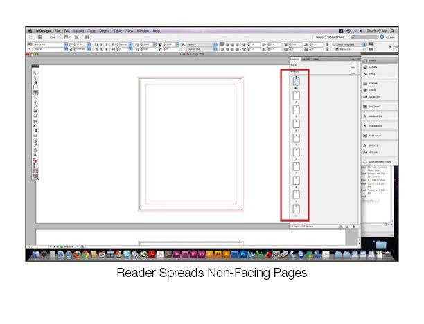
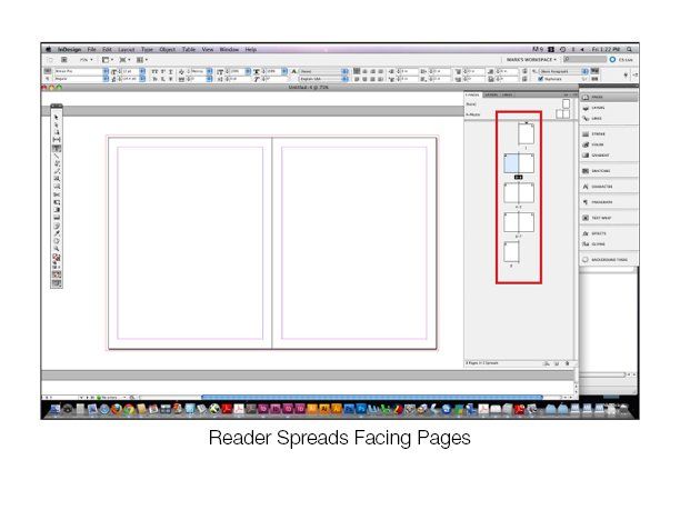
Reader Spreads, also known as Reader Order, is simply placing the pages of a document in sequential order with each page having it’s own work space or having two or more pages facing, or aligned next to each other ("facing pages"). In Adobe InDesign, for example, the pages would be numbered sequentially and placed 1, 2, 3, 4, 5, etc. Facing pages, or a side-by-side alignment, is useful when pages have a common background or there is artwork that crosses over from one page to the next.
The illustrations below show screen shots of the Pages pallet with these numbering sequences. The sequence on the left shows the pages placed individually, while the sequence on the right shows the pages placed in order but side-by-side. This side-by-side orientatin, also known as facing pages, is useful when pages have a common background or there is artwork that crosses over from one page to the next.
Due to the nature of the Execuprint workflow, a final print PDF output in Reader Spreads (pages in sequential order) is the preferred mode for page sequencing – even though your working file may have been created using facing pages. As an added note, please be sure that your document has sufficient bleed area around your artwork. We cover the concept of bleed in the Crop Marks & Bleeds section.
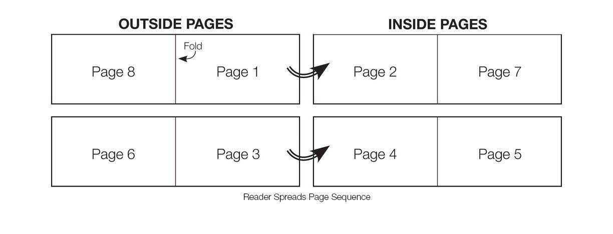
With Printer Spreads layout mode, pages are sequenced in the desktop program as they would actually print on a printing press. As a simple example, if a four-page brochure is to be printed on an 11 x 8.5 sheet, the front, or outside, of the sheet would have page four on the left and page one on the right. The back, or inside, of the sheet would have page two on the left and page three on the right. So, the outside pages would "back-up" to the Inside Pages. The finished result would generate a single-folded brochure with the pages in the correct order. The illustration below shows a simple eight-page example of a Printer Spreads layout.
Our in-house impositioning software automatically places Reader Spreads in the correct Printer Spreads orientation, thereby simplifying the destop publishing set-up process. For this reason, we prefer final print PDF’s to be submitted in Reader spread sequential order.